This blog post was part of an old breakdown I made a few years ago, I'm reposing it on my website now! You can check the 3D model here.
A few years ago, I decided to start a series of 3D dioramas inspired by my favorite retro games. In the end, I made only two of them, but the more I think about it, the more I realize this would be the perfect excuse to continue that project so I can get better acquainted with Blender! I'm writing this on my blog, for everyone to see, in the hopes that it'll motivate me to actually do it, instead of procrastinating.
Concept
Like a lot of people I love video game goodies. I have a few Kirby terrariums figures at home, I just love the idea of having a small world inside a glass globe/bottle/cube. Something about the way it is designed makes it just so endearing to me (I would love to have Dark Souls-themed terrariums, please Fromsoft????!!). That sparked the idea to me to try to make my own designs: I could show my love for my favorite franchise and have fun in the process!
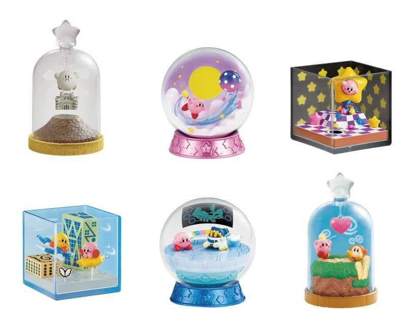
The Kirby terrariums that inspired me.
After gathering a list of my favorite retro games, I picked Zelda: A Link to the Past first (a very expected choice, I don't think I could've made a more cliché pick). When I'm planning a 3D fan-art, I love to either do a small animation or make them interactive! For this series, I opted show them through a playable WebGL viewport.
I like to start gathering inspiration by listening to music, I went through a couple of Zelda remixes until I found one that hit the spot: the dungeon theme.
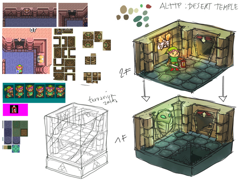
I gathered references from the game, to see what dungeon I would love to render and what details are part of this dungeon's essence. I choose the Desert Palace, gathered references and decided I would focus on a few specific details like the doors, the serpent statue, torches and pillars.
Some references are not from the Desert Palace, but tiles are the same, except colors.
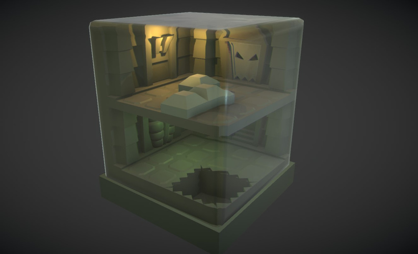
Since it's a diorama inside a glass dome, you can turn around it and I can't use the 4 sides to showcase wall details like they are in-game. I decided to spit it in two floors and model only two walls: this way I could have different lightings between floors and a staircase, without making the walls too crowded with details.
While working on the concepts, it was important to think about the scale of the floor tiles, walls and other elements. You don't want to make them too small, it needs to look balanced, so it doesn't feel empty but not cluttered either.
Here is a second version of the concept with more variations:
Worked a bit more on the mood/lighting too.
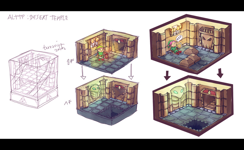
I added a trap door on the second floor to set it apart from the first floor, as well as adding puzzle blocks to fill the space on the second floor. The blocks could also be interactable in the WebGL and open the door.
The bottom floor is pretty much the same, I just tried to draw more accurately the tiles so I could have a good feeling of the space and added a pit to the first floor.
I kept the same color palette as the desert temple. I really like the mix of dusty yellow and greenish blue for the ground. The first floor will have a green and cold lighting, contrasting with the warm orange tones of the second floor's torches.
Blockout Modeling
After the concept phase I needed to test the volumes, see how the diorama would feel in 3D.
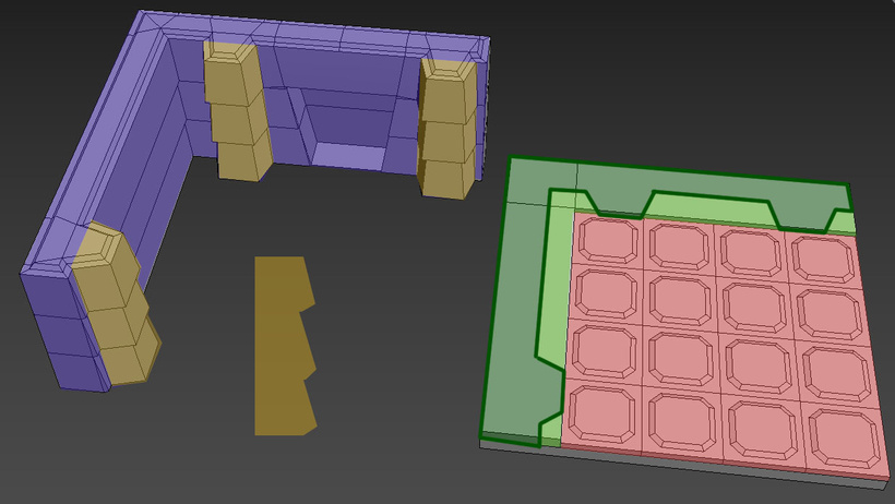
Seperating the different detail zones by mesh.
The first step in the blockout process was to determine the size of each "zone". I decided to start with the ground piece, and divide the floor by a 5x5 grid. Two grid stripes on the outer side were allocated to the wall so it could have enough depth, the rest would be a 4x4 grid made of ground tiles.
To respect the stylized look of this diorama, I focused on having thicker walls and a small number of ground tiles. It's important that the details are not extremely small, if you want to give that toy-feeling to the diorama.
When I was done with the ground, I built the wall on the green stripe space. I also added volume on the wall, adding a bit of depth to the stone stripes compared to the concept.
When creating cartoon scenes it's important to exaggerate shapes: I modified the pillars front appearance so they don't look rectangular anymore, it break the profile and makes it more interesting as well. Same thing for the wall, it was too flat before, adding more depth to the profile makes it more interesting to look at.
It was also important to have enough depth for the wall and the floor height. Since this 3D model is inspired by real life toys it had to look believable that it could exist in real life.
There is no real rule to that kind of design, it's more about the flow and feelings when you look at it. I like to zoom out often, see how it looks from afar. If I cannot read the details well from a smaller scale that means I need to remove details!
When I was done with the first floor blockout, I made the second floor and the glass case:
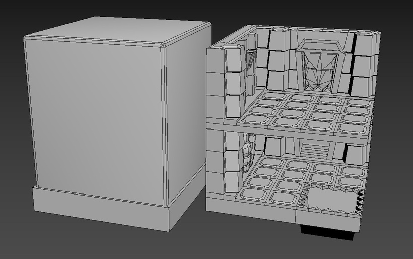
Wow, look at that blockout!
Since all the shapes are quite simple it was fast to build the first blockout and could even give it a little more detail than just cubes. What I wanted to validate with this blockout was the balance of all shapes together and if the design was working in 3D.
Once that was done, the model was exported to Unity to add a first lighting pass:
Made the glass shader beforehand but I'll cover it in the next blogpost.
I used 2 point lights to determine where my sources of lighting would be, following my concept.
That's it for the first part of the breakdown, in the next part I'll focus on the modeling.
Bye-bye 👋🐁