Hello again 🐁!
After going over what goes into the first steps of designing furniture sets, I'm going to talk about more in depth stuff:
- Quick overview of planning
- Determining the visual style of models
- 3D production pipeline for this project
Those 3 points are deeply intertwined but I'm going to separate them for your reading ease. I didn't determine the planning before having a go at the whole process, same for the visual style: It was full of trials and errors.
🗓️ Production planning
I'm probably going to repeat that a billion times but, planning to do a whole lot of assets alone is always daunting. For this project, like the previous one, I'm in charge of most of the visual part of the game. So, not only do I have to model everything, but also take care of the UI, texturing, shaders, etc.
Since every asset is tied to a puzzle, I need a large amount of them to be able to give enough gameplay time for players!
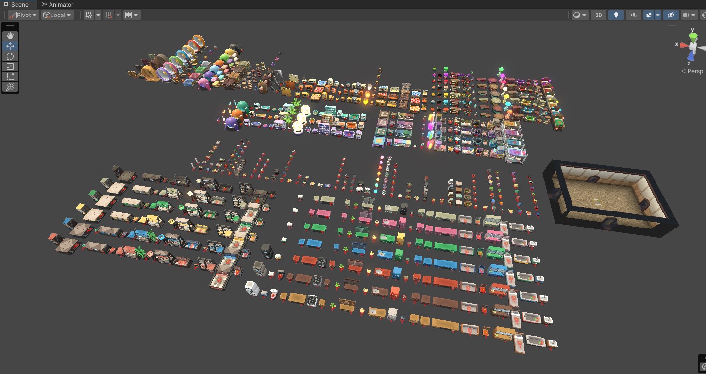
I have so many assets now...
Not everything has to be furniture since we also reward the player with costume accessories for the rodent. This is where my previous task of listing the number of assets per sets came in handy! I looked at other nonogram games to see how many puzzles they featured and they land between 250 to 400 for the latest Picross game. WHICH IS A LOT.
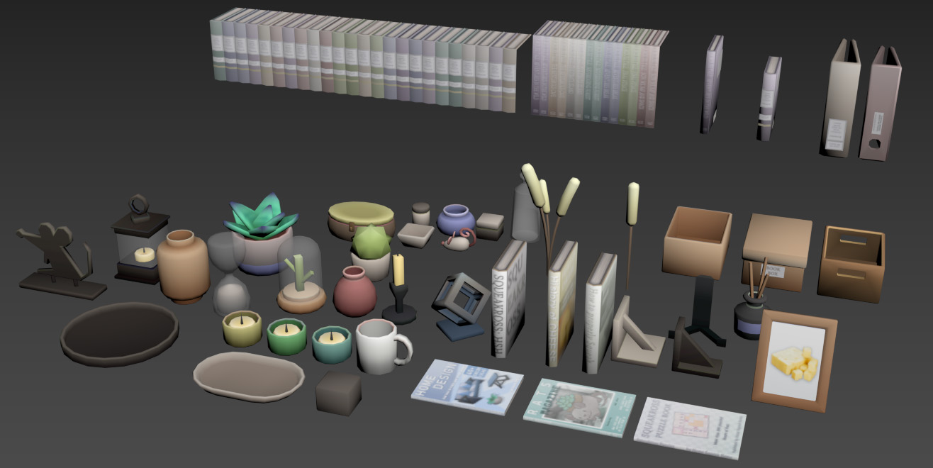
I choose to first list every costumes I could think of and small props ideas (not part of sets) since those would be smaller in numbers. With all I listed above it gave me around 60 assets for accessories and small props. I just decided then I would make 10 sets and that would give me at around 160 assets.
And with all that I arrived around 220 puzzles/assets in total! Woah.
That's still quite a lot but also I was like, squeak it, sometimes you just gotta throw some numbers and go with it, so now I had a plan to start my production.
What was left was determining how much time this would take me, so I used the first 3 sets as a trial time for my production speed and see if my plan made sense. From the designing part to the integration of a full set, it took me approximately 2 weeks for each (Some sliding can be allowed if a set is more complicated).
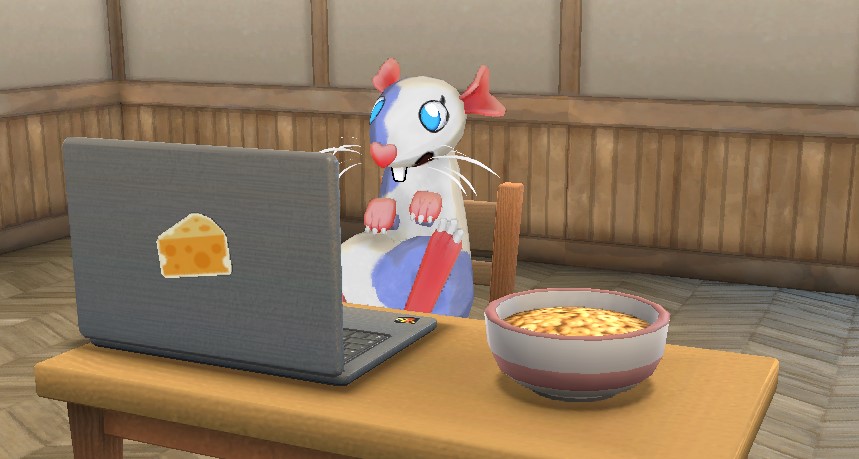
Actual pic of me hard at work on the assets.
🎨 Finding a visual style
I'm not a concept artist skilled in 2D rendering or anything, so my way of finding a proper style is by listing a game I like, and listing all my technical constraints. Then I just test stuff and refine until I like how it looks.
I absolutely love Animal Crossing New Horizon and of course that would be my reference for the style I want to go for. Animal Crossing has been one of my favourite game series since the Gamecube, I've always dreamed about making a housing game because of that, so here I am finally doing it!
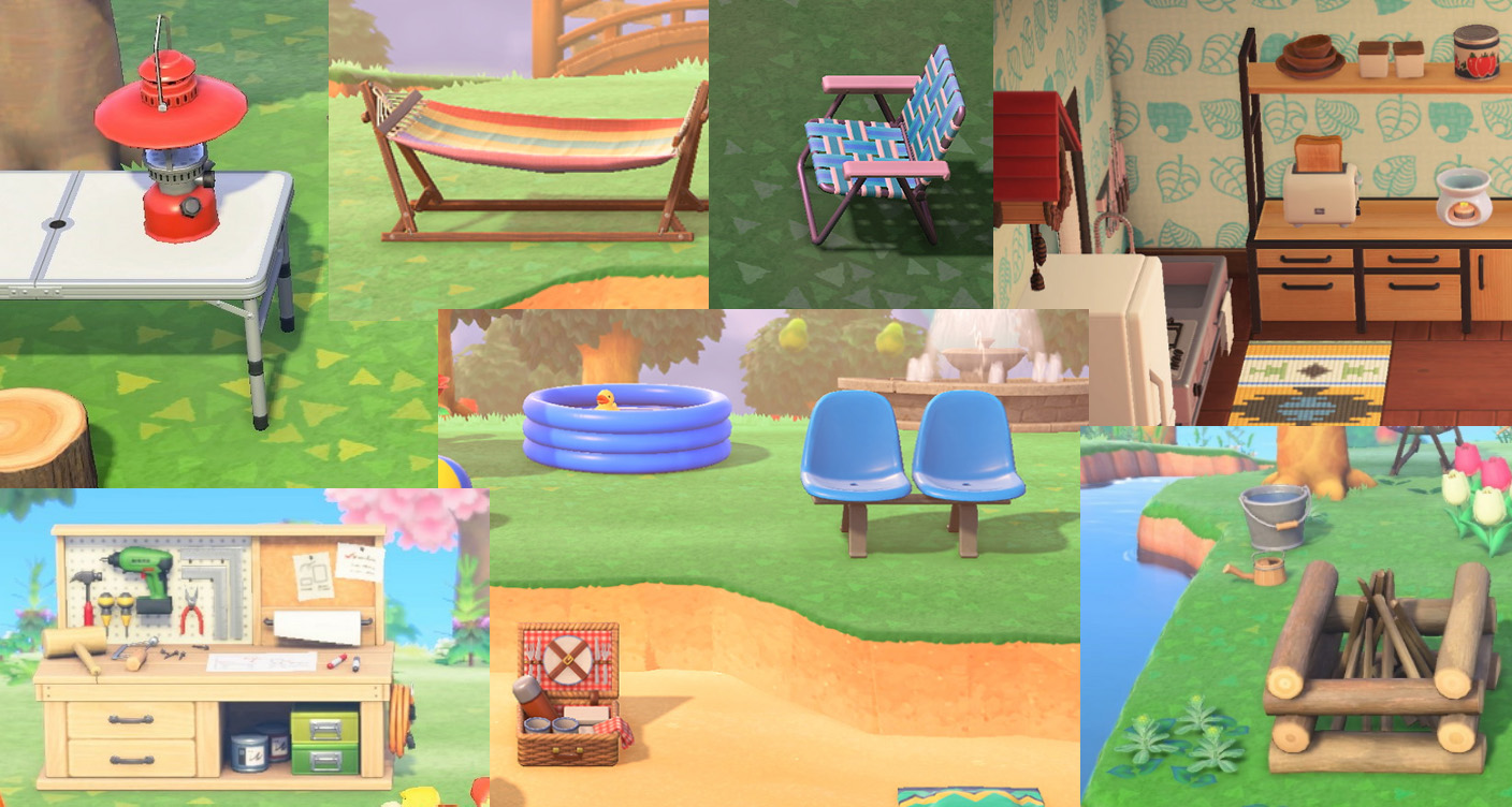
A few close ups on Animal Crossing New Horizon assets.
A few things I wanted to replicate like in Animal Crossing New Horizon: objects looks detailed and super clean, have simple textures on them, not too much noise. The game has a cartoony style but the furniture actually almost all possess realistic proportions and also have Normal Maps details on it. What keeps it all together also is the smaller details, like bolts, stickers and other structure parts that makes those furniture even more believable!
With that settled, I will go over my constraints:
- I want to use a big atlas texture for everything (also our game only has 5 rooms so no need to do big optimization plans by having one texture for each asset)
- I can't spend hours painting or creating textures
- UV Unwrap needs to be FAST
- Camera is relatively far away, you can zoom but not super close
- I have 200+ assets to make
- I'm alone in this
Now let's get to work!
💻 3D Production Pipeline
Due to the texture map limitations I choose (one big atlas), I decided to use mostly color gradient swatches for my Base Color texture, keeping large spaces for details like branding, book covers, patterns and others details.
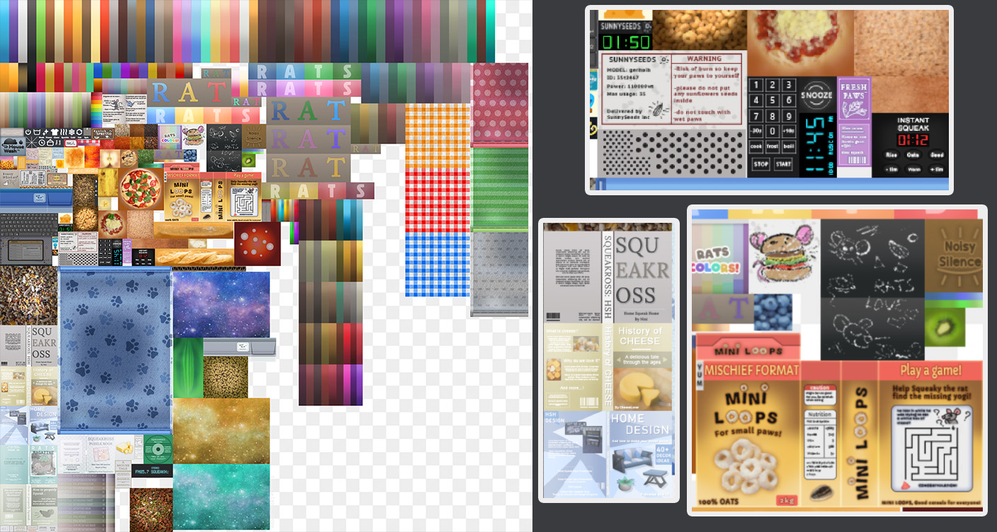
Here is how my Base Color looks right now, featuring a few silly close-ups.
The Normal Map will be an atlas as well, covering various different surfaces I need: wood, grain, fabric, etc. My goal is to use the Normal Map to do most of the smaller surface details so it's not too strong and you still get a feel of the material.
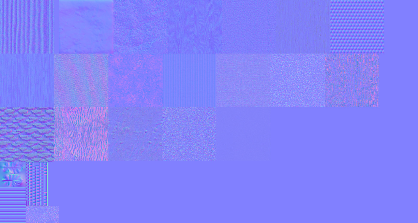
Normal Map, looks like a neat patchworks, both NM and BC are 2k textures.
Since I don't have any Roughness Map, I am just using the vertex alpha data to control the Roughness on a furniture. No Metallic Map.
Vertex Alpha on a couple of assets, white is not reflective, black is very reflective.
On top of that, I decided to add a fresnel to the shader, but I didn't want it to affect my model too much, so I coupled it with a few data already present on my model. The fresnel has the Normal Map as surface normal data so it only affects the bumps on my normal map and not the dips. I also masked the bottom faces of the mesh and added the possibility to mask the fresnel using Vertex Color.
Vertex Color black where I don't want the fresnel to appear.
All of this goes into a big multiply with the Base Color and a vertex channel to erase the fresnel in places I don't want it, like in cavities where light doesn't directly reach.
Since our main lighting source is just one directional light, the models could look kind of flat. The fresnel makes the normal map details stand out a bit more.
Looks neat in the end!
I haven't talked much about my 3D modeling process, now is the right time!
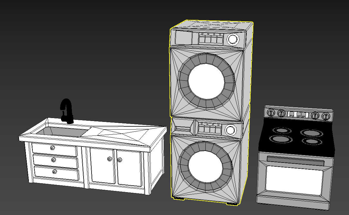
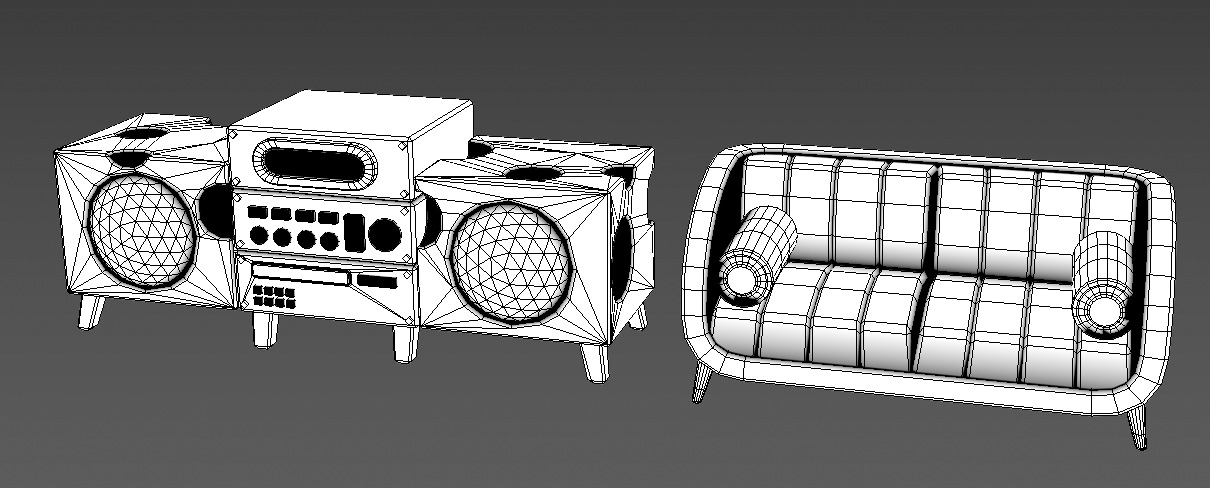
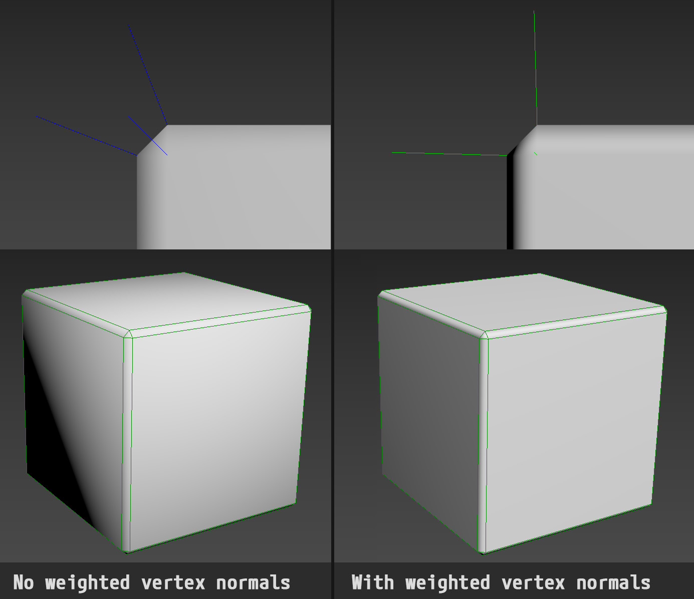
The 3D models are quite simple, I try to limit the details on each model but since I'm using the normal map for finer surface details I'm adding bevels on all the shapes to make them appear very sharp. The bevels alone would look quite ugly on lowpoly models so I am using a tool in 3DS Max called "SurfaceWeightedNormals".
Basically what it does is modifying the vertex normal information on the model to make them perpendicular to the flat surfaces around, each bevel or rounded part will look more sharp in contrast.
Clean looks.
Here is a before/after with a game asset, it's really easy to spot the differences with assets that have low poly count:
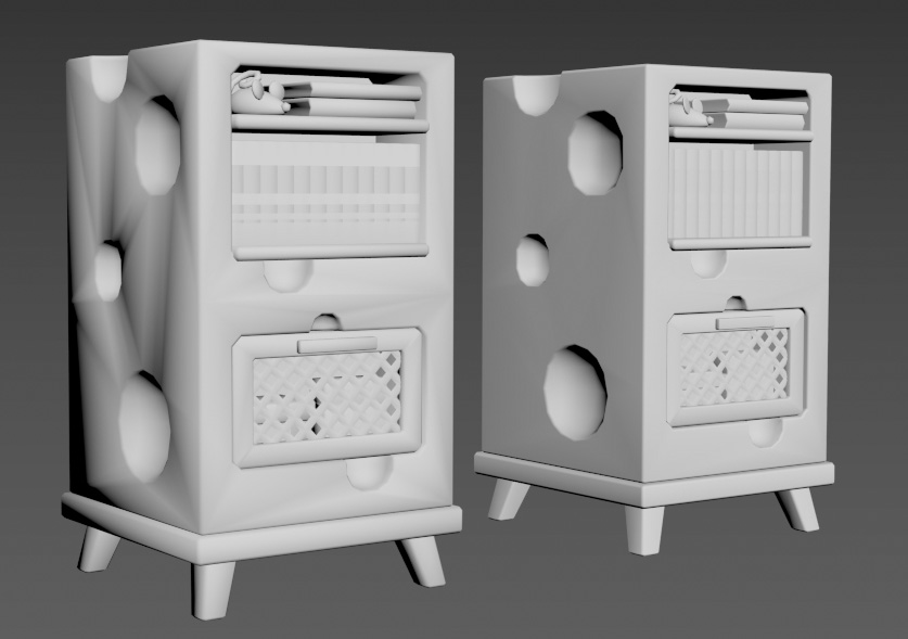
Left: no weighted normals, right: weighted normals.
You can find more information about this following those links:
- https://docs.blender.org/manual/en/latest/modeling/modifiers/normals/weighted_normal.html
- https://help.autodesk.com/view/3DSMAX/2023/ENU/?guid=GUID-6BFC22D5-D9DA-45BC-87A7-D95BFAD083E1 (apparently 3DS Max has it implemented now? wow never tried it I use 2022)
- The script I'm using in 3DS Max http://www.bytehazard.com/articles/wnormals.html
Aside from that, you might've guessed but since I'm using 2 different texture atlases for my base color and normal map, I'm using a different UV channel for each.
One issue I had was that using the channel 0 for Base Color and channel 1 for Normal Map was giving me a buggy normal map view on my models for some reason??? Confusing, I might have a few guesses, like it didn't like that I had collapsed UVs for the last channel I was using? Some hidden checkbox I missed? If anyone has an idea please let me know 🤓.
I didn't want to spend hours debugging this so I just swapped the normal map (Channel 0 now) and base color (channel 1 now). It made my work easier later on and I might be thankful for this bug, but I'm not spoiling the surprise.
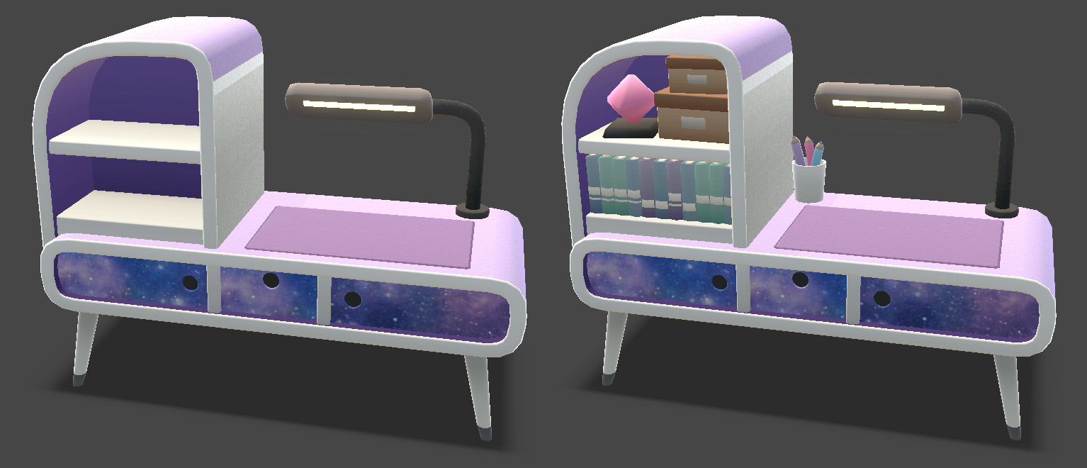
Other than that my models are very simple, I try to reuse as much as I can (table foots, cushions, bolts, etc) when building a set.
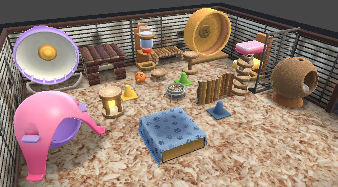
I also made a few very basic little props to scatter over any shelving to make the furniture looks less empty. Those little props have no normal map details (I map them on a middle value) and I erase the fresnel on it as I do not want those props to stand out.
It looks so cute, I'm adding more each time I do a set.
Seems like a small addition but it really DOES make a difference in the end. And for a low amount of efforts since I am reusing props I already modeled.
It looks so cute, I'm adding more each time I do a set.
Well, that was it for today! Thank you for taking the time to read through it.
I haven't thought yet about the next post, it'll probably be a mix of wallpaper/rooms creation, maybe costumes and how we tackled the color variation implementation!
👋🐁