Looking for other articles in the series?
Hey there! It's been a while 🐁
Last time I talked about quite a few things concerning furniture design and production. I want to dedicate this post to cover a couple of stuff about furnishing/home creation, as well as technical things I didn't have time to mention before.
Taking a break from furniture and let's talk about the home itself! The rooms went through various changes through development, even after the game's release.
My Home Squeak Home
At the beginning of the project, we had only one room planned. But as furniture planning was becoming more and more clear on my side, I realized it might be way too sad to be limited to only one room to place your hundreds of newly acquired furnishing!
It did require a bit of refactoring, code wise, to be able to support other rooms, but we were so early in the project it didn't matter much. It was also an opportunity for us to create new goals for the players to unlock alongside furniture!
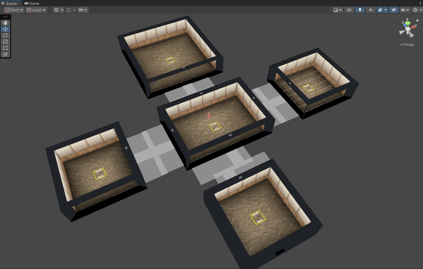
All the rooms in engine! They're not all active at the same time. Rooms you're not visiting are hidden.
The room themselves are built following a grid of 1 meter by 1 meter. We used this metric since this is the base size for a Unity cube, so it's easier for us to work with. Every piece of furniture fits on the grid, in the same manner it's done in the first Animal Crossing game! We choose to not have half cells like the more recent game entries, where you can place items in a more precise way.
We could've implemented it but it was a matter of keeping the game scope manageable for us. While this gives players more decoration possibilities, it also drastically increase the work to be done for the decoration system! While the decoration is a big part of the game it is not a mandatory part like the puzzle phase (also at that time we weren't even sure if the game was going to be successful so we just didn't want to pour hours of work into a system like this).
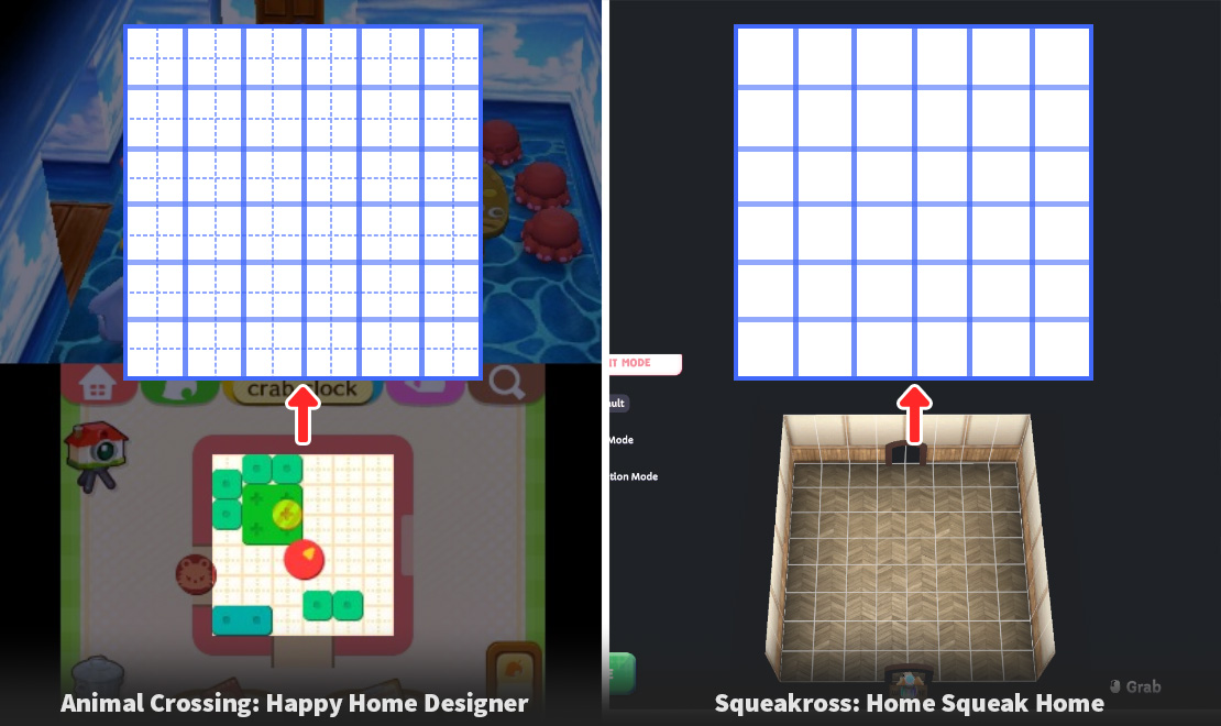
Comparison between Animal Crossing and Squeakross: you can see the floor grid of Animal Crossing has each square subdivided by 4. That allows you to place furniture over half a grid cell.
We had to settle on a grid size for a basic room in Squeakross. This was decided after working on a couple of things first: I had to model a couple of furnitures, test different room sizes to see how to felt visually. When that was done, I went back to my furniture theme list, and brainstormed a bit about what kind of floor and wallpapers would fit there. Animal crossing always have wallpapers that tiles a lot and I wanted a bit more freedom with them.
After a few tests I settled on having a base room of 8 by 8 cells. Following the same plan to make as little textures as I could for the game, it was decided that we would use one texture to pack all the wallpapers together, and a second one for the floors! With that plan in mind, the the first room was made.
The 3D models
Walls and ground are seperated in different meshes: it allows us to hide a wall when it's not facing the camera. Walls have some thickness to it, it was initially added because the house's background was not black. In the end, the background color ended up matching the wall's added thickness, but we kept that 3D part because it prevents it to look like it's paper's thin walls when the nearby room visual is next to the room.
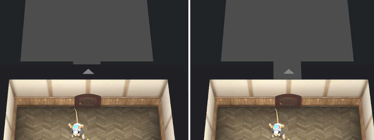
Left: with the wall thickness | Right: without wall thickness. It's a small detail but it matters to me, ok?!
I did try to add a couple of different designs on the rooms 3D meshes, like adding baseboards but dropped the idea after a few tests. What worked best was to keep it very simple, no details, just walls and ground. You can see an exploded view below:
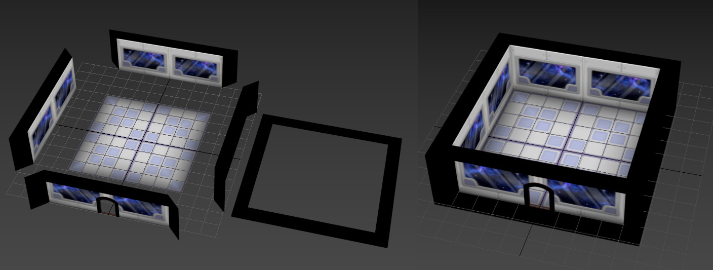
Around 180 triangles in total for one room. The only geometry cuts that are here are for vertex color shading (shown later).
The way I modeled the walls were to accomodate the wallpaper texture. The texture is a 2048 by 2048 pixels, divided in 16 squares, each of them being a wallpaper. A wall is mapped only on the first square. Each tile needs to tile perfectly because it will be repeated along the wall. In-engine, the wallpaper shader has values we can control by script to move the UV island to any tile on the texture. This allows us to swap wallpaper types when a player changes it via the home decoration browser!
As you can see the wall mesh, the 3D surface is rectangular while the texture is square. I did make the 3D model square at first but I didn't like the way it looked. I didn't mind to stretch them a bit so I just made all my textures slightly squished to adapt to that constraint.
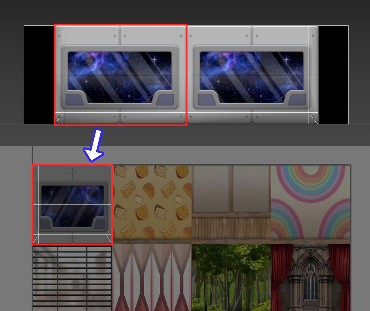
To make sure the UVs would tile perfectly I aligned the edges on values I entered by hand in the UVW viewer in 3DS max. Making sure the vertices on the edges were always aligned and positioned on the edges of each square.
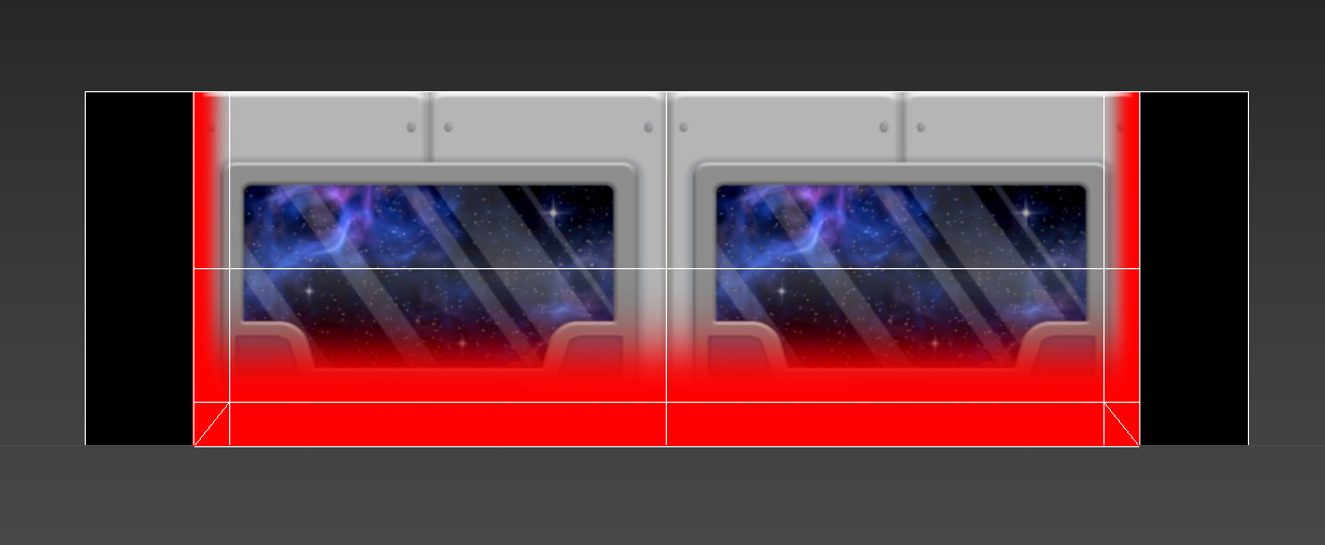
You probably realized there were few more polygons on the wall geometry. It was added so we would be able to have a shadow gradient on the walls using vertex color. This allows us to have a bit of depth on the walls. As shown below, the colored gradient is displaying where the vertex color is set.
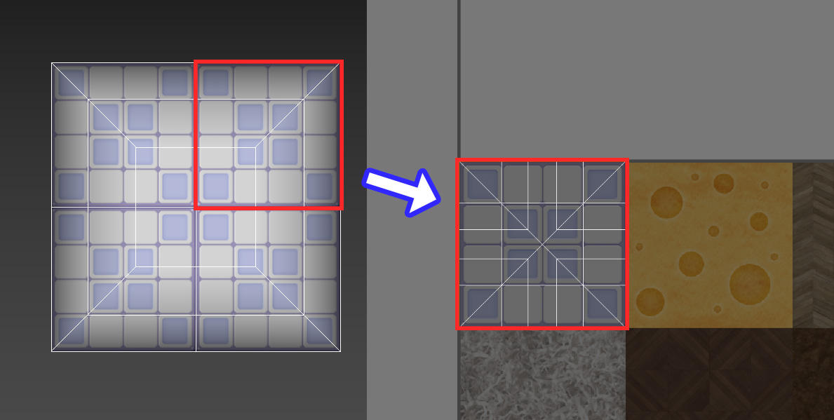
The same method was used for the ground. It works the same: the floor was divided in 4 bigger tiles that are mapped on the same square on the floor texture. Additional cuts on the geometry were also made to add vertex color for a shadow gradient.
This will make more sense when I talk about the room lighting.
About the vertex color addition: we have an ambient occlusion post-effect but the darker areas are much finer, so it helps to have a larger gradient to give that missing sense of depth.
House Textures and Shader
The floors and wallpaper textures are both made following the same 4 by 4 grid. The wallpapers texture set is composed of two 2048 by 2048 pixels maps: a base color and a mask. The mask texture contains two black and white maps: a color variation mask and an emissive map. These two maps are stored respectively in the red and green channel of the mask texture. I didn't use any normal, metallic and roughness maps for the wallpapers. Due to the wall orientation towards the light, they appear quite flat. Adding surface details like a normal map didn't work that well in our setup, so I left that out.
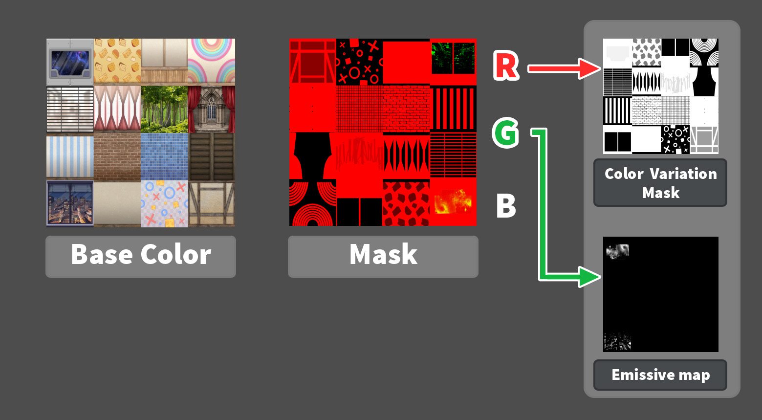
Since the color variation and emissive maps only contains black and white data, they each can be stored in a single color channel.
The floors texture set is quite similar, but there a few more maps: a roughness stored in the alpha channel of the base color, and a normal map!
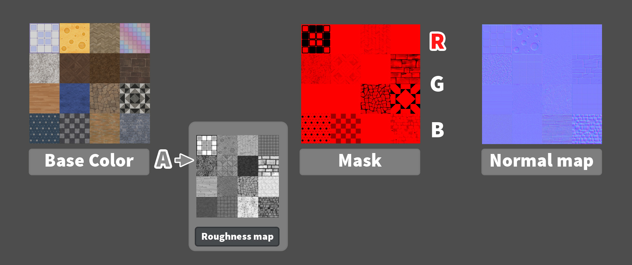
In retrospective I could've added the roughness to the blue channel of the mask... gamedev is not linear and I was too lazy to refactor that.
Now let's talk about the shader. The walls and ground materials share the same shader! It's composed of a few things:
- Texture coordinates that we can control by script to move the UVs to a different spot on the texture.
- Color variation mask used as an alpha to mix the initial base color with one who had its hue, saturation, level values modified.
- Vertex color multiplied with the base color.
- Metallic value at 0 and roughness map multiplied to a 0 to 1 slider so I can disable it for walls.
And the last item that was added more recently:
- A black and white alpha mask with texture coordinates on the U axis linked to a slider from 0 to 1: this is used to cut a hole for the door alongside each wall and be able to move it in the house edit mode. I'll write about this at the end of the post.
The hue, saturation and other values to tweak the base color are linked to a data file (scriptable object in Unity) for each wallpaper and floor item, we can then input how many color variations we want for each.
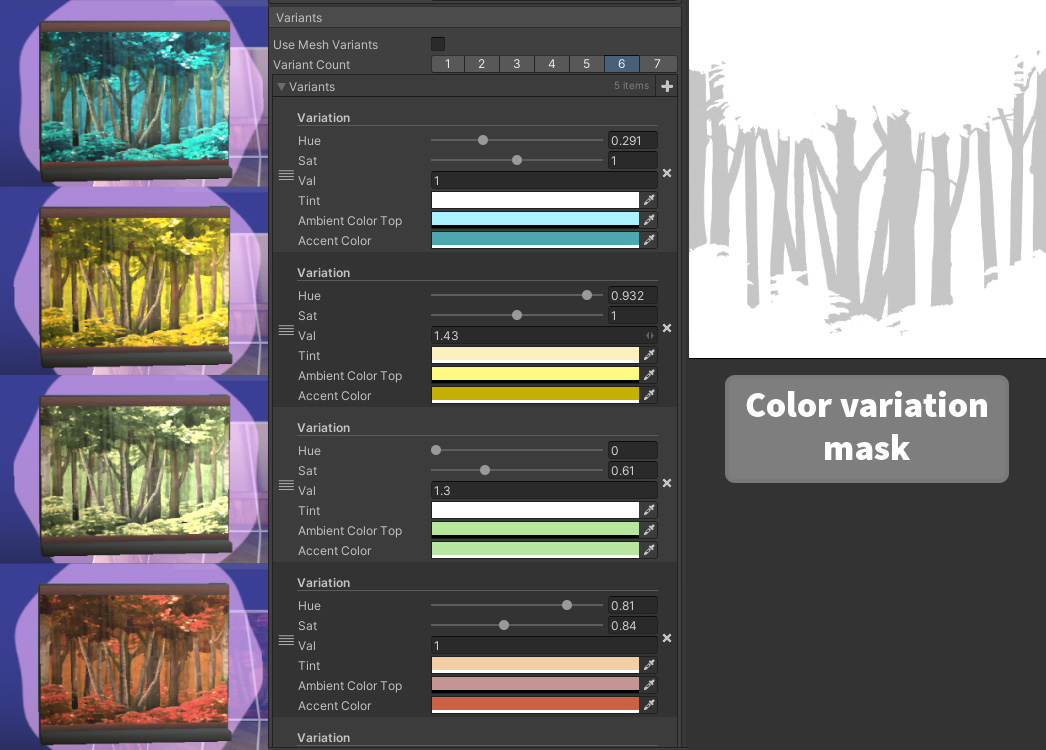
So neat!
Doing color variations that way for wallpapers and floors was a better option for us since we wanted to avoid dealing with too many textures. It looks a bit less pretty due to the nature of the system, and is a bit restrictive since you cannot completely change the texture.... but we felt like it was a good middle ground to have. The mask prevent the whole texture to be recolored, like on the image above: tree trunks are not completely black, so they retain a bit of brown color and are not entirely modified by the hue/saturation/level values.
The Lighting
To lit the rooms we have multiple things in place:
- A directional light, realtime: it lits everything, is aimed downwards, casts shadows for the rodent and furniture.
- A spot light in the middle of each room, realtime: to add a bit of depth, it's aimed at the center of each room, doesn't cast shadow.
- Different color profiles that modify Unity's environment lighting colors, as well as the directional and spot light colors.
This allows us to let the players customize their home with different lighting presets.
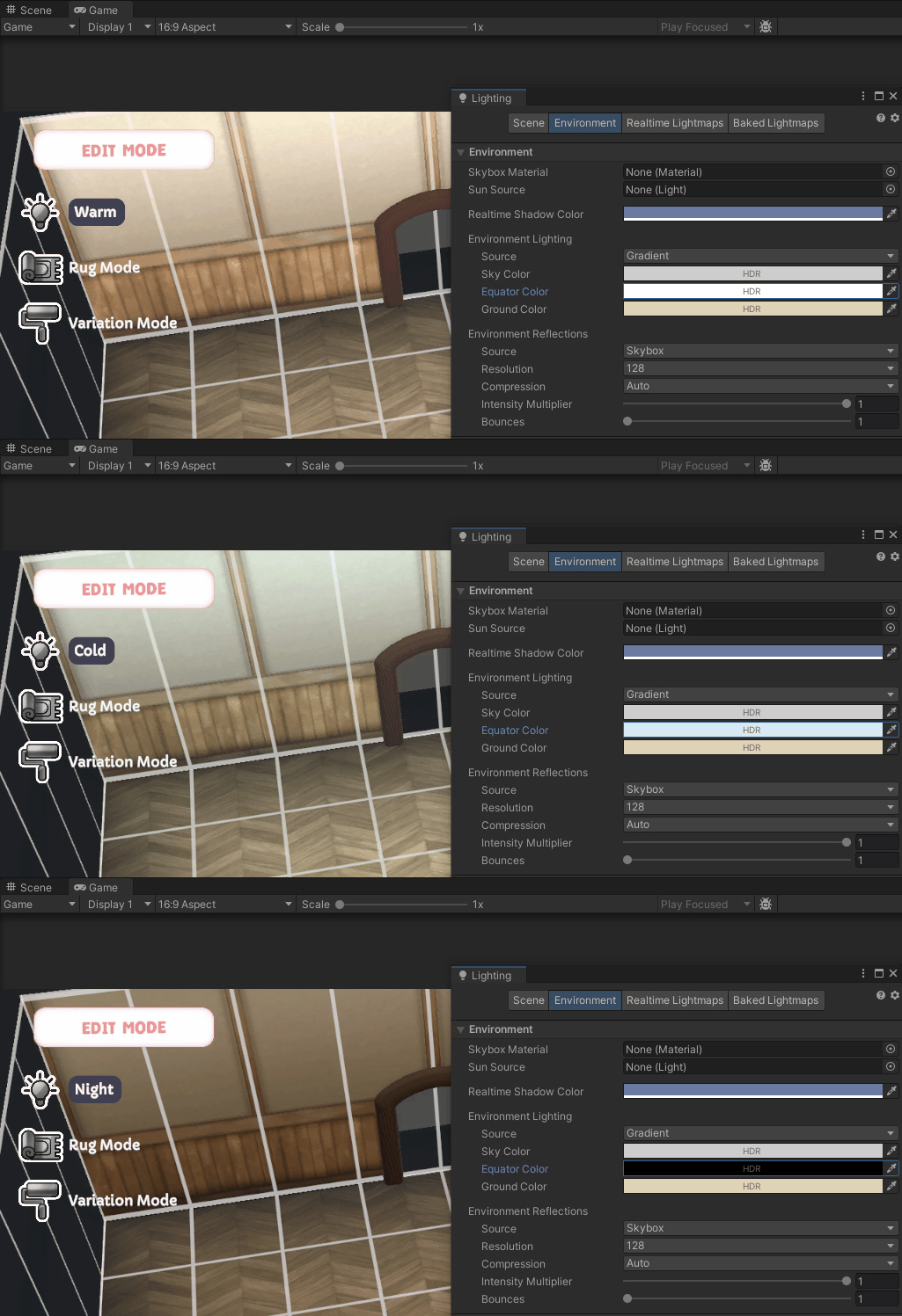
Showing the different light profiles and how it affects the walls and floors.
This setup is fairly simple but it gives us a good flexibility to make different kind of atmospheres. Just a side note about shadows: you may have realized that each furniture also has a sprite shadow placed under each 3D model.
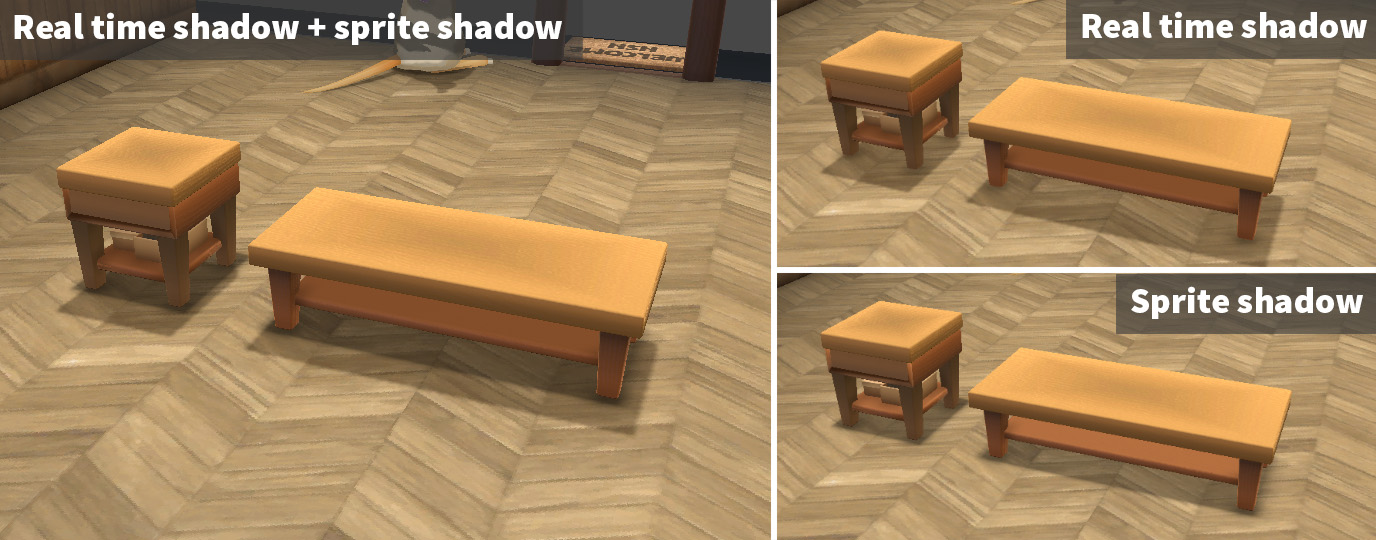
The two shadows help anchor the furniture even more in the environment, mimicking a strong ambient occlusion.
A Moving Door?
Earlier, I mentioned something about moving doors in the player's house. This is something that wasn't initially in-game at first, but was requested multiple times. As I was decorating my rodent home I also felt like it was missing. At first, doors in rooms were placed in the middle of each wall, which made it a bit annoying to decorate but that was part of the constraints. This meant the center room, being in the middle of the four other rooms, felt a bit hard to decorate.
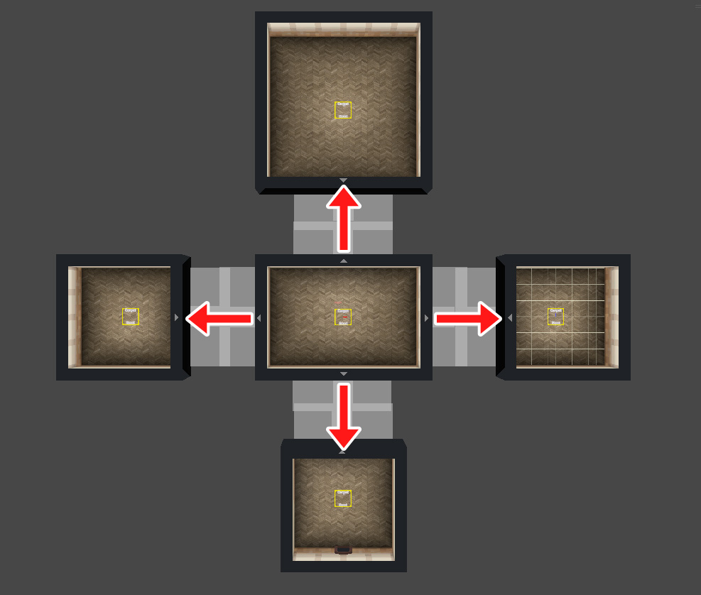
The middle room has FOUR doors!
It's always tricky to change something like this when a game has been released for a while. The compromise we found was use an alpha map: each wall that had a door on it would have a new UV channel, mapped on a black and white texture where the door hole would be black (so rendered transparent) and the rest of the wall white. In combination to that, we just had to offset the texture coordinates in shader to move the door alongside the wall.
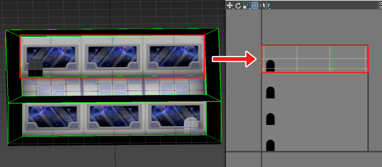
The alpha is mapped on the 2nd UV channel as the first one is taken by the base color. We have 4 row of door alphas but only the first one is used: this is for the future as we want to add the option to swap to different door types.
It was then a matter of linking these offset values to the wall decoration system grid and we have a functional moving door! The texture itself has a lower resolution (256 by 256 pixels) because the edges will be hidden by the door frame 3D mesh.
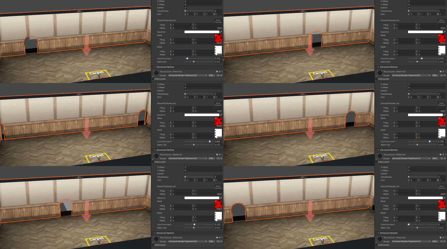
The door texture coordinates has an offset on the U axis controlled by a slider from 0 to 1.
Here is how it looks like when the door placement has been properly integrated with the current decoration grid:
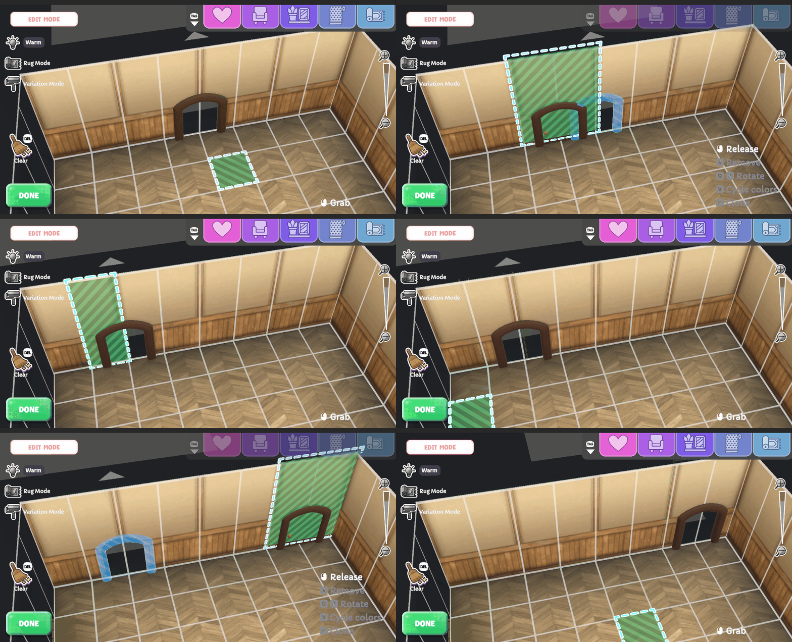
Squeakross has a feature that Animal Crossing doesn't have???!
Furniture Color Variations
Okay so this is something I wanted to talk about for a WHILE! Not because it's an incredibly impressive technical solution, but just because the way we implemented it felt very smart.This is absolutely not a feature we've planned at the beginning, we worked on it after a lot of furniture sets were done because it seemed completely out of scope for us. As more people joined our Discord server and seemed to want this feature, we gave it another thought.
A couple of info about the game's state at that time: we didn't have the normal vs challenges puzzles we have right now. Each puzzle would give you one furniture with the basic color and you could already place it as many times as you want in a room... that would be it! When people mentioned wanting to have different color variations it prompted us to think about how to unlock that feature. It felt too easy to just give everything at the same time for solving each puzzle. This sparked the idea of having a second puzzle for each furniture, a harder one, but rewarding you with another perk related to that furniture!
Now that the design idea was born, we needed a way to add the actual color variations to each item. Having a new texture for each color was out of the question due to how the texture was made (see Designing Furniture Part 2), so we looked into was data was available to us in Unity. Turns out Unity can allow up to 8 UV channels per mesh! If you remember the Designing Furniture Part 2 blog post, the first UV channel is used for the normal map, so that leaves us with 7 channels!
Having the color variations in the UV channels also means I can use the same texture I have been using for all furniture! I won't be able to make any changes to the geometry of the mesh but that's fine.
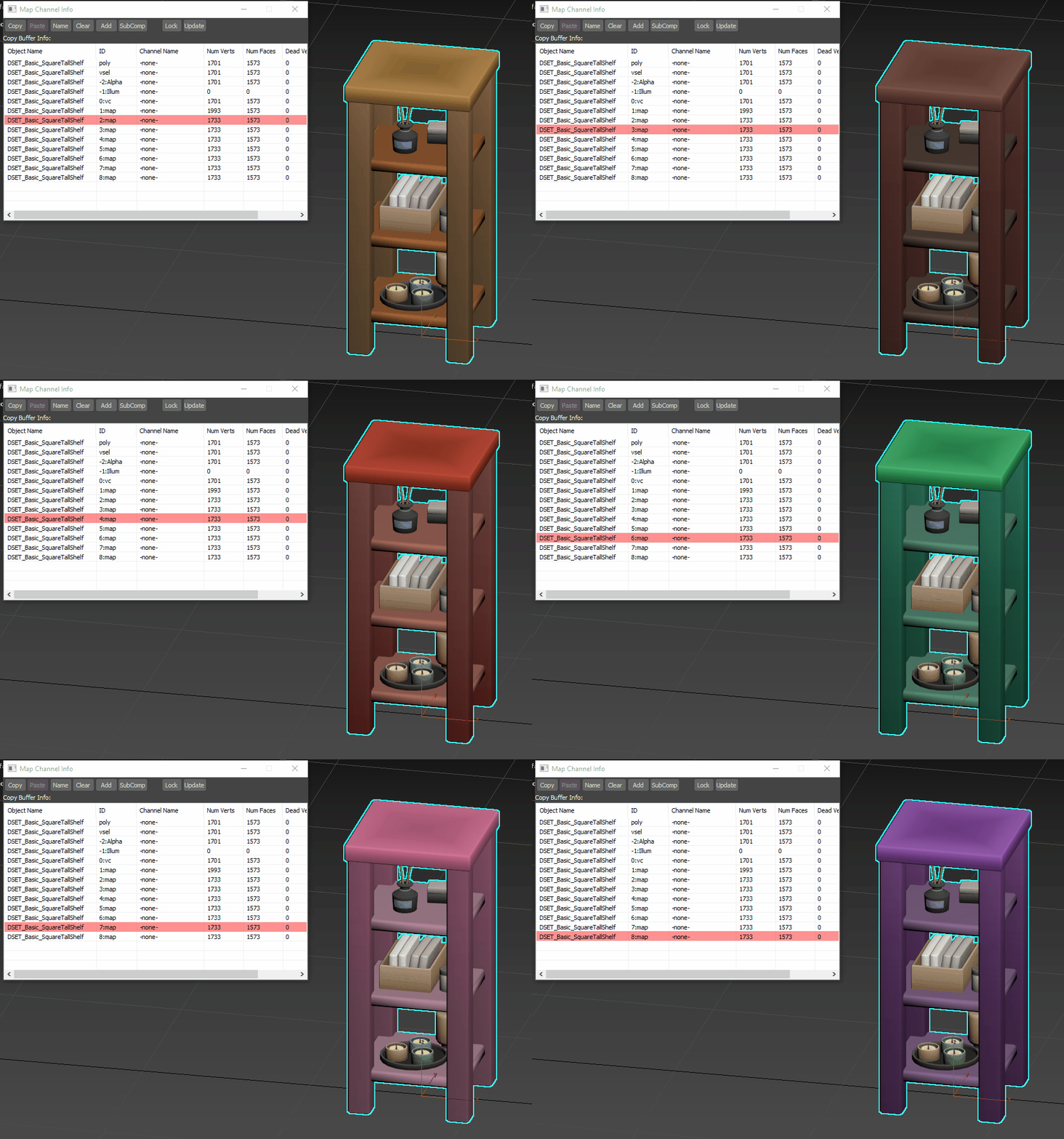
3DS max said "array starts at one", the mental gymnastics of having to deal with that and my first color variation UV is on channel 1, uuh wait... no 2!
Since the furniture main texture is quite simple, I had enough space on it that allowed me to do cool variations like these posters, flags and different felt patterns for the rodent table:
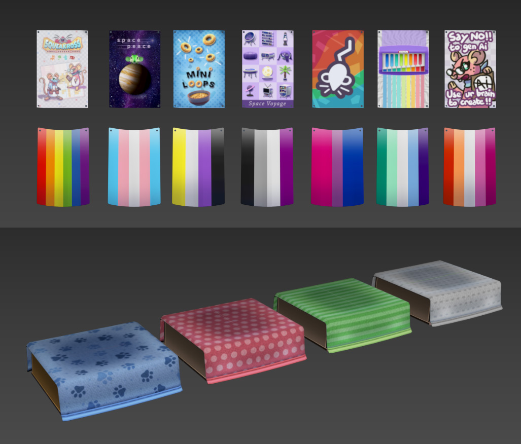
Having only 7 possibilities of color variations can be a bit limited but it's nice to have constraints for these kind of stuff. How to you decide how many colors are too much otherwise?!
We had to make adjustments in the furniture shader as well, we added switches to allow us to decide which UV channel to use. Since We don't want to do that on runtime, we made as many material duplicates as we needed color variations. Each of them has the appropriate UV channel checked:
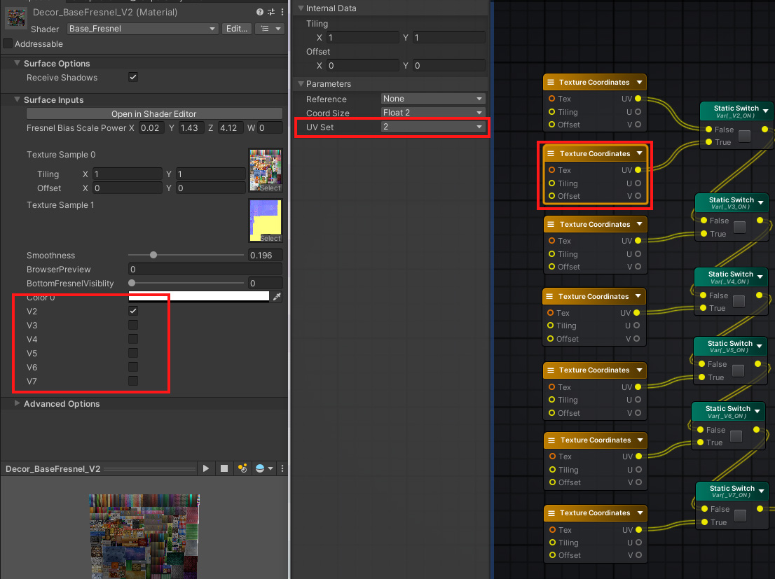
Showing an example by highligting the parameter from one of our material variations.
After that, it was a matter of swapping which material is used on the furniture model when the player browse through color variations.
That's it for today's post! It took me a while to come back to writing about Squeakross, between the game's updates and a few projects I was working on the side (like the Ratty Pocket, made in Godot!), but I want to continue writing about Squeakross' game art!
Next post will be dedicated to the rodent character model and costumes. I realized I completely forgot to talk about the wall and edge furniture system we added in the last big update, I may add that too! Until then...
ByeBye 👋🐁